RAIIZZ
Redesigned the whole Raiizz website to improve its usability, hierarchy, and visual design.

PREVIOUS VERSION


Introduction
BACKGROUND
Raiizz is an online fundraising marketplace supporting schools and nonprofits. Raiizz was founded and owned by minority women who are passionate about education and environmental sustainibility.
Non-profit segment
Profit segment
Website redesign

Infographics
Marketplace mobile app
Problems with current design
Overwhelming visual elements
-
The illustrations on Raiizz's previous website are too colorful, resulting unclear call to action buttons and navigation links.
-
Raiizz's slogan that was intended to explain briefly about Raiizz were blending in with the colorful illustrations, so neither buyers/sellers nor organizations understood what Raiizz is.
Inconsistent hierarchy
-
The inconsistency of the hierarchy of the website design has caused Raiizz resources, mission, and vision to not be well delivered to the users.
-
Some of text sizes on the website are too small and the call-to-action buttons were unclear.
Design Challenge
MY TASK
In this project, I was assigned to redesign the non-profit segment. I had to redesign Raiizz's whole website to increase its usability and visual design as well as the infographics for three different types of users.
Non-profit segment
DESIGN GOALS

Better Website Usability
Users should be able to find the info, the resources and how to access the marketplace.

Effective Illustrations
Call-to-action buttons should not be lost due to overwhelming and colorful illustrations.

Useful Infographics
They should explain briefly what Raiizz is to all buyers/sellers
and organizations.
Research
Conducting usability testing with the current website
Due to lack of quantitative data on the old website, I conducted usability testing with three people in the target audience
Insight 1
Navigation links were hidden

"About" Raiizz that consists useful information about them was completely hidden. They did not notice these links were there.
Insight 2
Confusing CTA
-
The color of the button made it seem to be unclickable.
-
The button blends in with the pink color due to similarity in the tones.
-
The texts were too small.

Insight 3
Ineffective contact page

-
Users thought the picture was taking more space than the actual contact information.
-
Users felt that text was too small.
Insight 4
Users doubt the credibility of the website
-
Because the design seemed outdated, it made the users think twice on buying or selling on the marketplace.
-
Users were hoping to see more of what Raiizz is about to gain more trust.
COMPETITOR ANALYSIS
Name
Description
Pros
Cons
An American online e-commerce platform that facilitates transactions between sellers and buyers.
A social commerce marketplace where people in the United States can buy and sell new or used clothing, shoes, and accessories
Listing the trendy items at the left side may encourage the user to sign up/login
Further information on scroll down for those who need more information about the business itself and how it works.
No explanation about the business before asking for signing up
The login/sign up link took the entire landing page.
Description
Pros
Cons

INFORMATION ARCHITECTURE
From the insights, I decided to redefine the information architecture for the website.

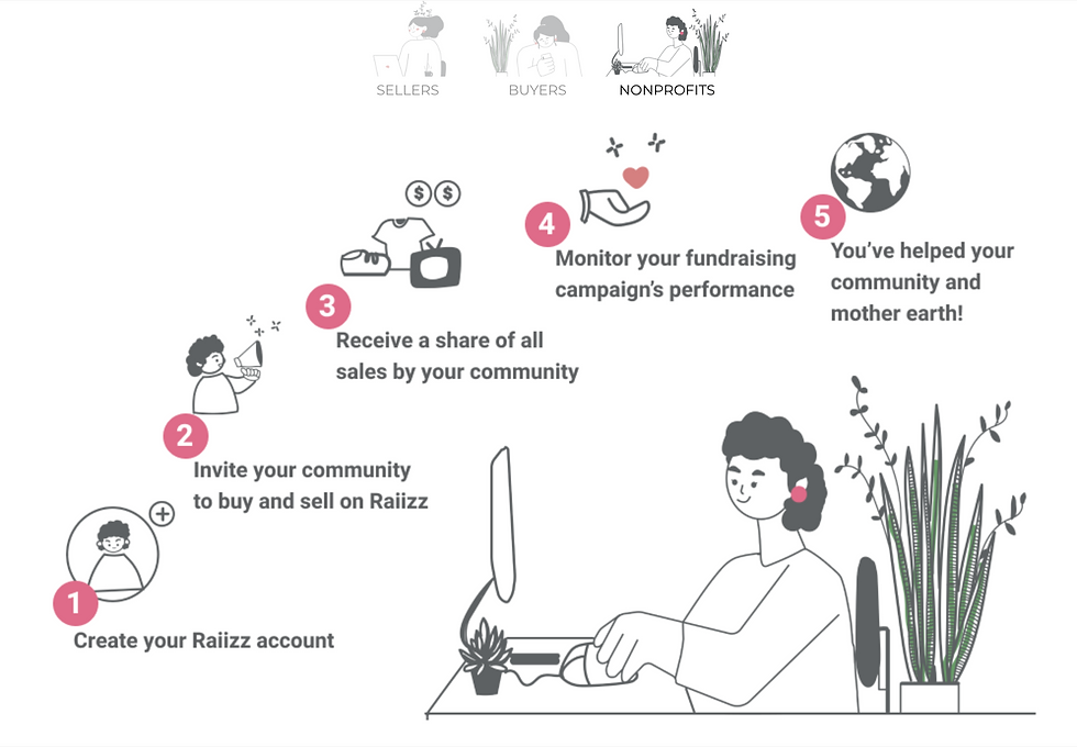
INFOGRAPHICS
Infographics for Raiizz were one of my main task in this project. This is an important element so that the three types of Raiizz's users understand briefly how Raiizz works.
Based from what I learn about Raiizz, I came up with three different infographics for buyers, sellers, and organizations. My goal was to make the illustration simple so that it does not distract the users from the informations about Raiizz.